Fina
Rustic had its moment
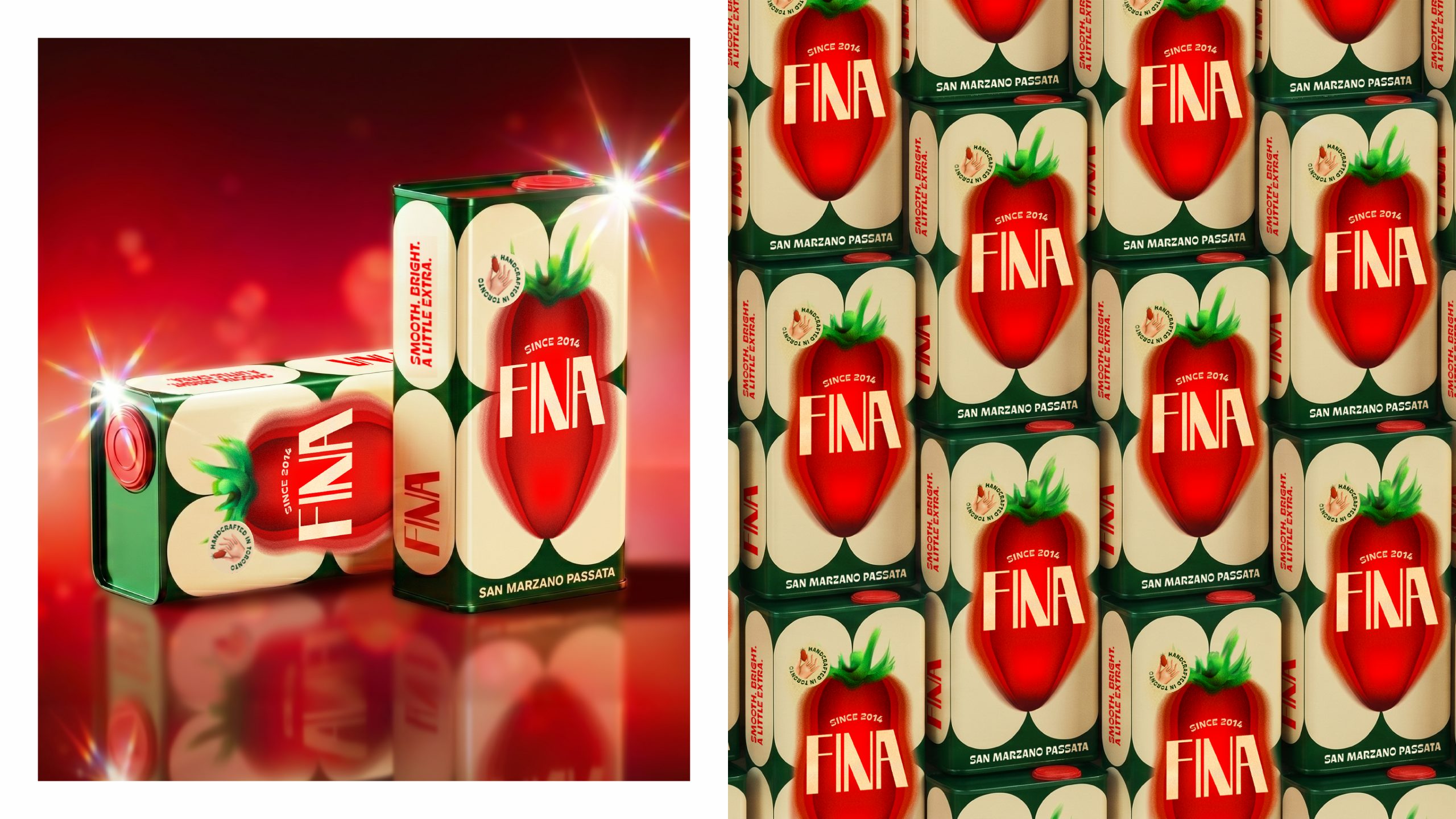
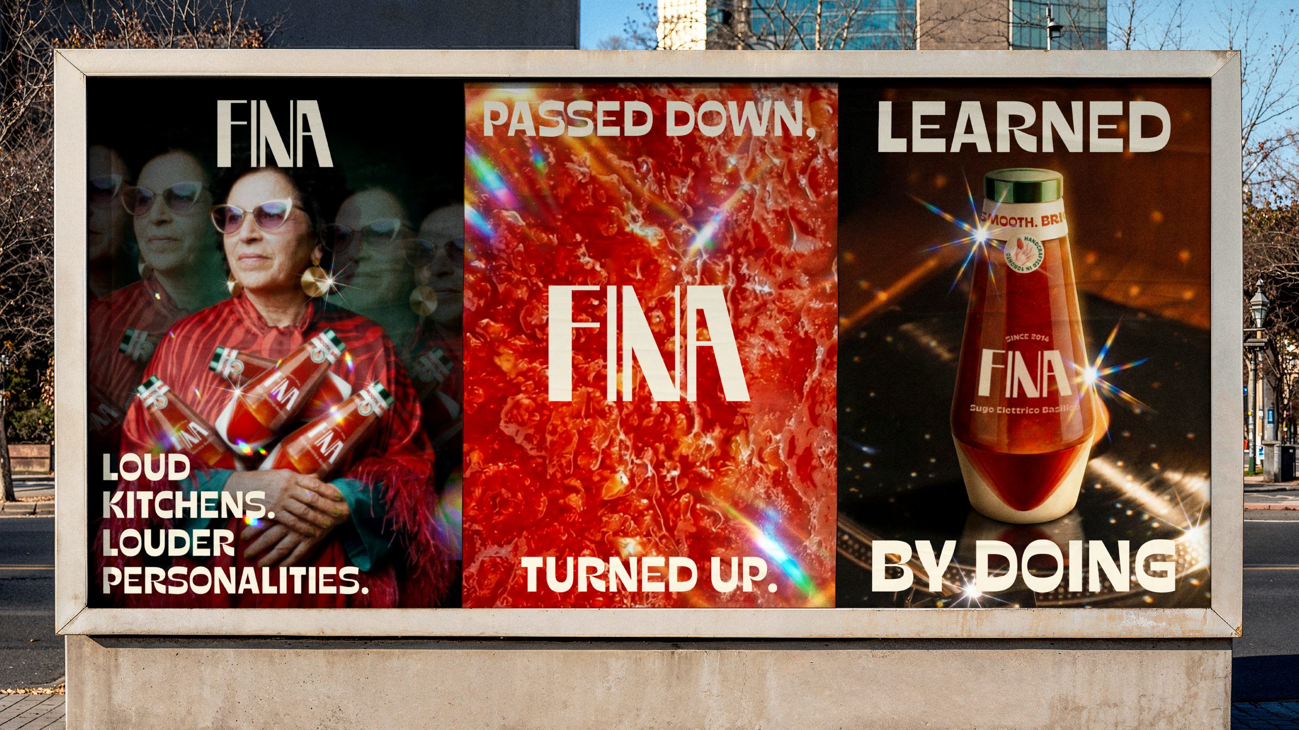
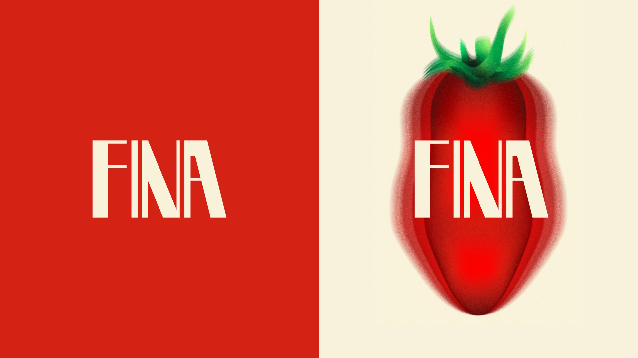
FINA is a passion project born from a tradition of making tomato sauce with friends that started in 2014. Every late summer, tomatoes, music, and long days in the kitchen come together. The name is inspired by the women who shaped those traditions: Giuseppina, on my wife’s side and my two grandmothers, both named Josefina. “Fina” became the natural meeting point between them, while also carrying a second meaning: Fine, delicate, and precise.
The visual identity draws heavily from the colorful world of
Italo-Disco. Bold typography, saturated reds, glares, and Stroboscopic Photography playful forms the logo and overall aesthetic direction. At the heart of the project is the idea that cooking is learned through repetition, instinct, and shared experience rather than strict measurements.
Smooth. Bright. A little extra.
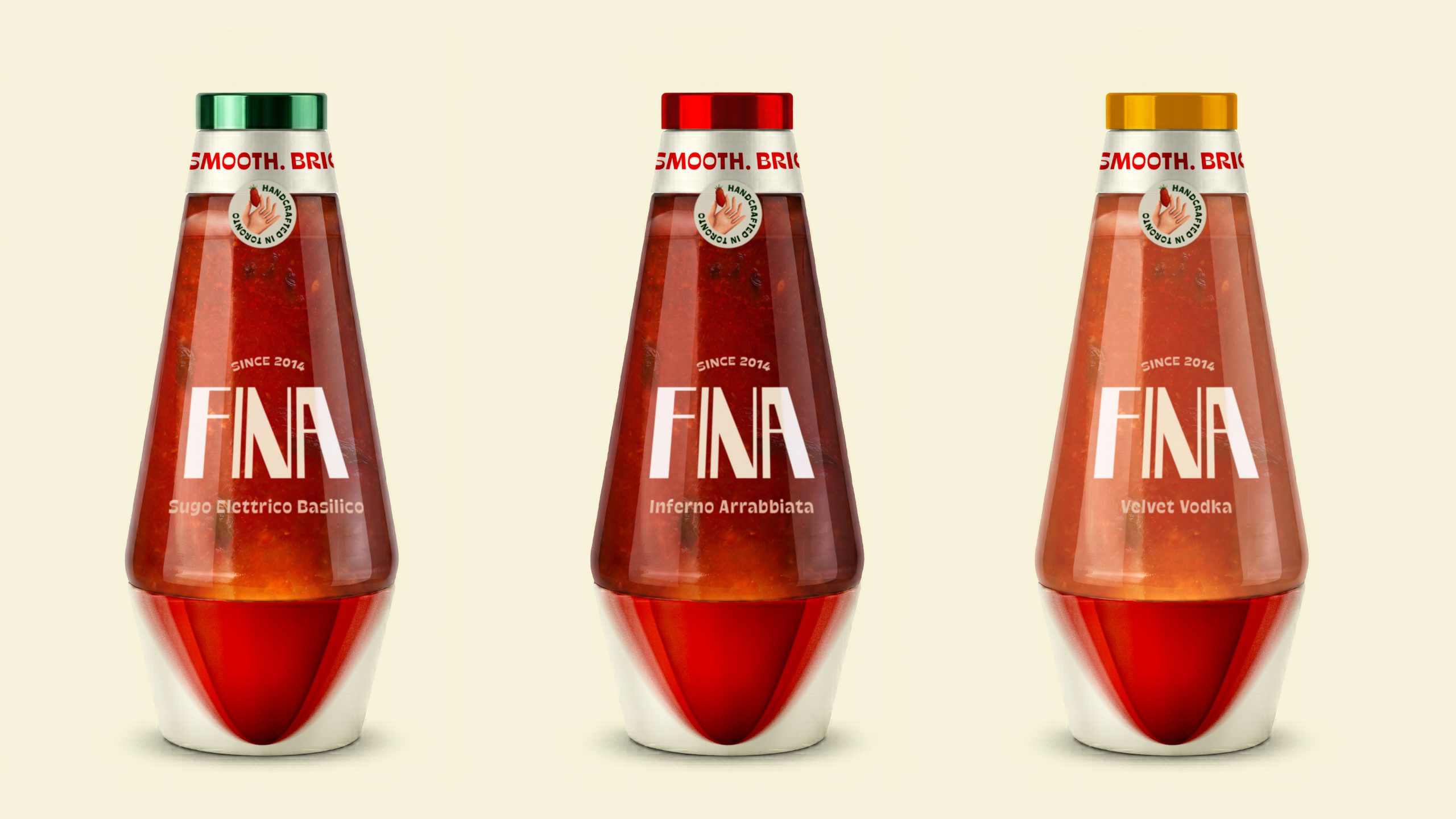
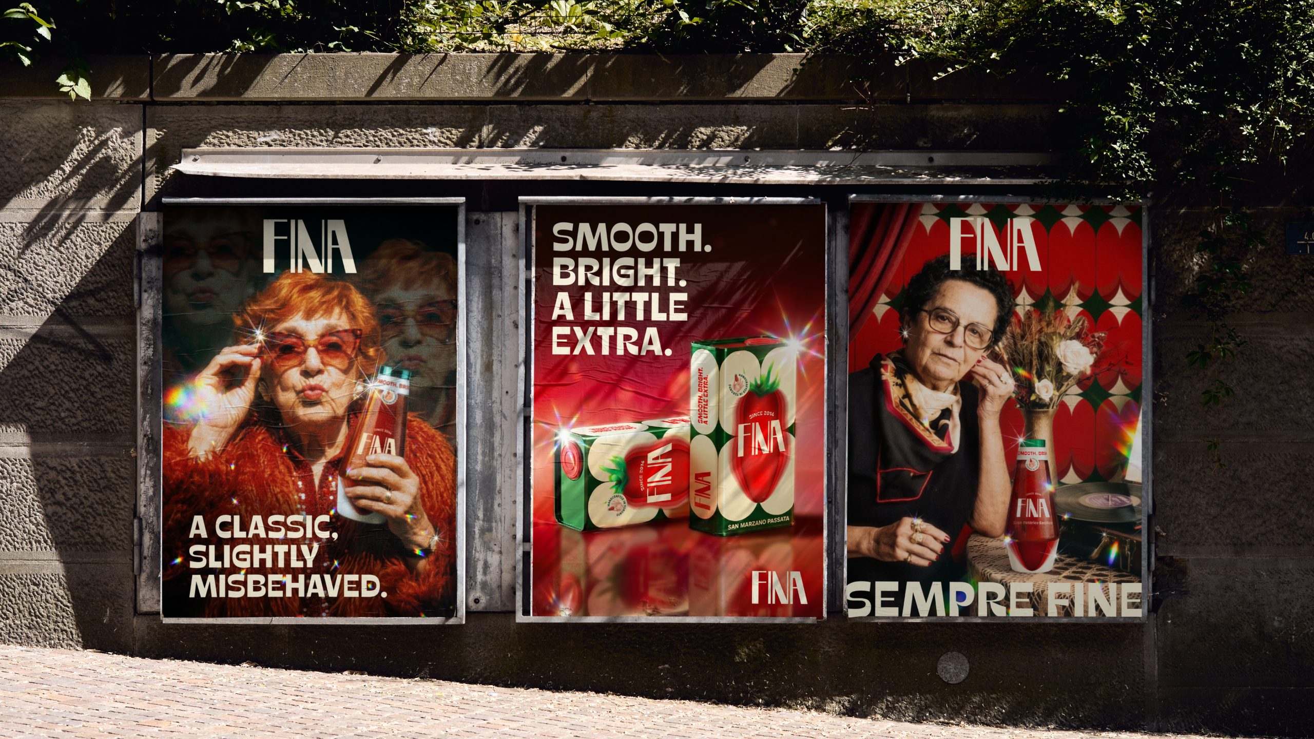
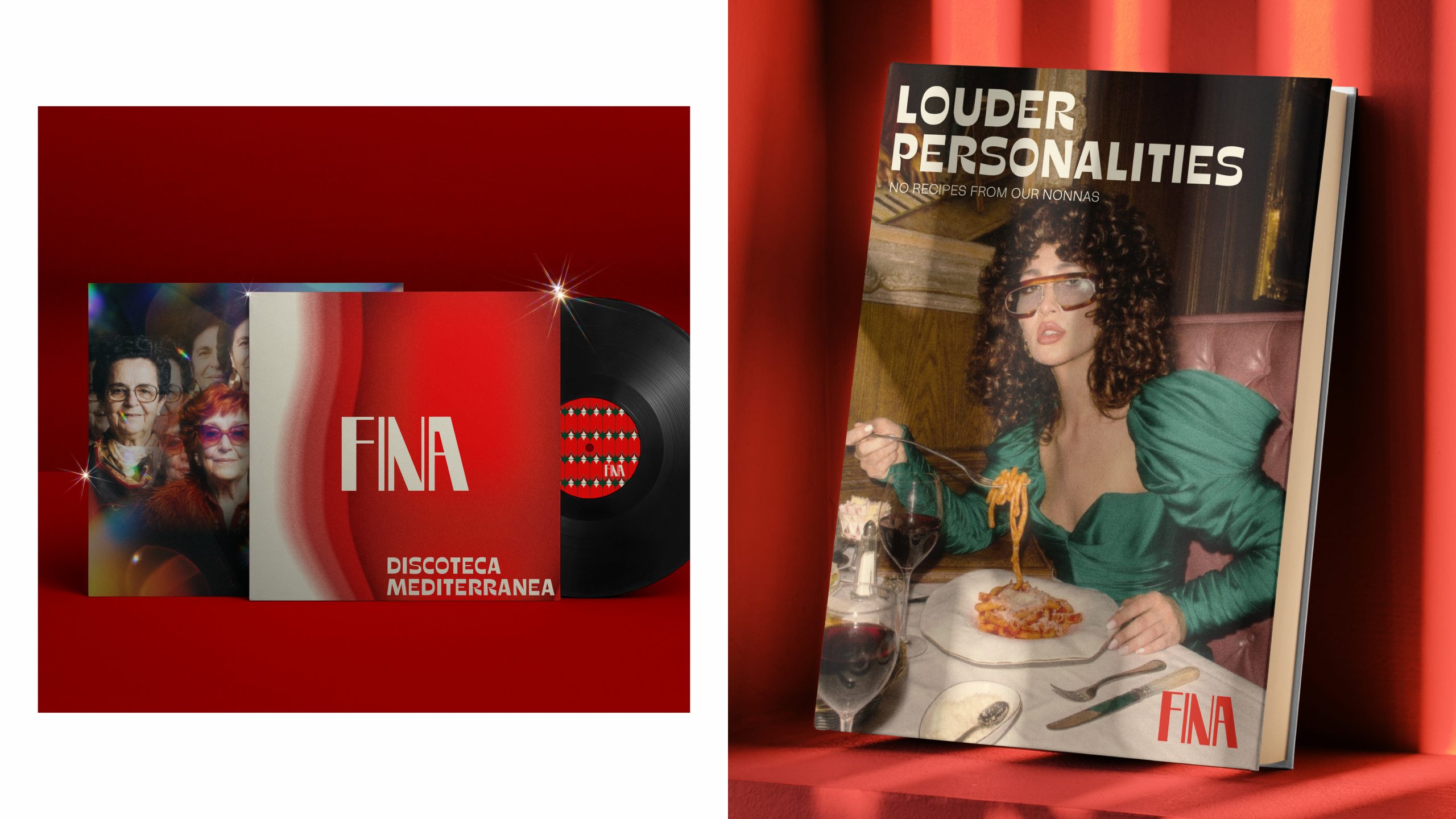
The packaging extends this narrative through a series of collectible objects. The passata is presented in a metallic can, while the sauce bottles take inspiration from lava lamps silhouettes. Taking advantage of the latest AI engines, old family photographs of our nonnas turned them into our models for posters.
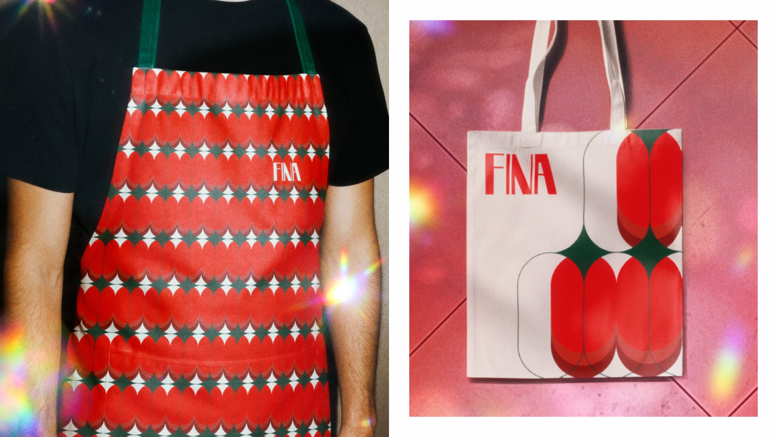
Supporting the identity is a custom flat pattern inspired by tomatoes growing on the vine, designed for use across merchandise and applications. The universe expands further through companion pieces including a Italo Disco vinyl compilation and a book that celebrates the fashion and culture around that era.